


2. False Impressions (5)
Dec 10, 2014
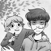
Trying a different font for English. Thoughts?
Pro 1: I like how it feels more down to earth because most fully English scenes (i.e. the ones taking place in our world) are also down to earth compared to the fantastic magical world scenes.
Pro 2: It's CLEARLY, in-your-facely different from the Korean font.
Con: Not as immediately legible as the font I was using before.
Also: lots of unexplained things going on, and for that I apologize. My stories tend to be better read in huge chunks (i.e. multiple chapters) so you don't have to wait too long to find out certain things. I'm trying to make it enjoyable as a trickling webcomic, too, but I still have a long way to go.
Top comment
I like the font choice :D it's so funny that the first thing Ethan does is stretching xD it's like wow, priorities you know.
Recommendation for you
Recommendation
Ghost Lights
LGBTQ+ 726.7k likes
Recommendation
Copper eyes
BL 906.6k likes

Recommendation
Long Exposure
LGBTQ+ 2.3m likes
Recommendation
Humor me
Slice of life 2.8m likes
Recommendation
Heartstopper
LGBTQ+ 6.7m likes
Recommendation
The Little Trashmaid
Comedy 638.1k likes

Feeling lucky
Random series you may like
2.7m views13.4k subscribers

Comments (58)
See all