


Page 5-6
Aug 15, 2025

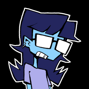
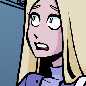
Be honest, do you like the colors? I've always felt kind of insecure about my coloring (it's never been my favorite thing to do tbh)

Top comment
The colours are fuckin fantastic! Not easy to do an analogous palette. The way you handle shades, contrast, and priority is fantastic. What I love the most is how vibrant it is, while also not being too flourescent or 'neon'-y. It looks akin to coloured marker on paper.
So yeah, I know I won't fix insecurity but hopefully this comment helps just a little bit. Above all, your drive to push yourself as a writer/illustrator is the most admirable and waiting for this series is a highlight of my day.
EDIT: I also want to point to how well oppositional colours (like purple and yellow) are used. Those are hallmarks of a tertiary palette, which meshes well with the mostly analogous palette of blue, purple, and pink in most panels on this page. Even the skin colours lean somewhere to pink/purple/orange, and yet it's still super pleasant. Even the hair colour in that one random guy (brown) meshes well! Your colour style here is super harmonious, nothing is dissonant and it's easy on my eyes! Bravo!
Also bisexual 'lighting'.
Recommendation for you
Recommendation
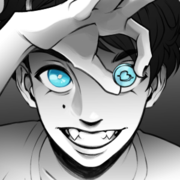
Copper eyes
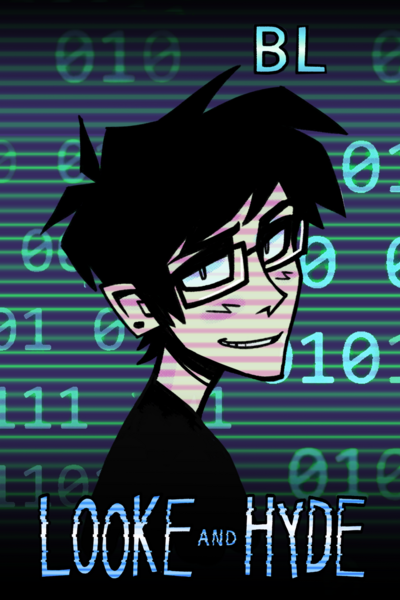
BL 1.2m likes
Recommendation
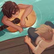
Out of the Blue
Romance 2.7m likes

Recommendation
Ghost Eyes
Thriller/Horror 1.8m likes

Recommendation
Strange and Wild
Fantasy 889.4k likes

Recommendation
A Love Unafraid
BL 800.7k likes
Recommendation
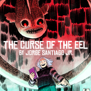
Curse of the Eel
Thriller/Horror 127k likes

Feeling lucky
Random series you may like
176.1k views2.5k subscribers
Comments (18)
See all