
newsfeed
-
Cover Tutorial for Novelists
Aug 06, 2020

Covers are great marketing tools, they have the power to show readers what your story is about at a glance. They can also hint at story genres and themes, and even set the tone of your series before someone has read your first chapter!
I: Inspiration
I: What do you like?
What do you want your readers to think of your book at a glance? Whether it be through colors or symbolism, choosing a theme is often a good place to start!
If you aren’t sure of what type of cover you want to make yet, note what you like/dislike about your favorite and least favorite covers. For example, if you find yourself gravitating more toward certain colors or types of fonts, when picking out novels in your genre, that’s probably something to keep in mind while designing yours!
Having a clear picture of what you want before creating your cover will make it easier to track your progress.
If you realize a theme isn’t working and another one fits your cover better, that’s totally okay—feel free to change your theme at any time!
Here are some cool covers from community creators on Tapas!


[Click on the covers to check out these series!]
What catches your eye about these covers? Is it the fact that there are two characters on the cover? Is it a certain color theme? It often helps to ask yourself why you enjoy a certain element on a particular cover, and see how you can apply this when making your own designs.
Please keep in mind that this is mostly a thought exercise, it is not recommended to directly or indirectly copy other people’s covers.
II: Possibilities to keep in mind.
Try thinking of a feature that distinguishes your characters from other protagonists, or your story from other novels. Does your main character use a special weapon? Is there a symbol you could put on your cover, like the emblem from your guild run by fancy dragons? Note down a list of any discerning character or story elements that make your universe immediately recognizable, and consider using some of them on your cover to make it stand out.
Tapas has found that covers containing people and faces are often the most successful as they are easier to recognize while browsing. Don’t let this fact deter you from experimenting with other formulas however, there can always be exceptions to this rule!
If you find the cover you’ve made isn’t getting as much traction as you’d hoped, nothing is final. You can always switch it out for something different via your dashboard with a single click, so feel free to experiment with different covers until you find the right one!
Don’t forget to take your genre into consideration. If you’re writing a romantic comedy, you probably don’t want to create a cover that appears to be representing a novel in the horror genre at a glance, as this could be misleading to some readers.

[In this example, we’re looking to make a romance novel cover. The left cover looks like it could belong to a horror novel, despite its other assets. This disparity in the image shown may confuse some readers, therefore, the image was switched out to give the cover a more harmonious feel.]
II: Discovering illustrations, photographs, and artists
I: Artwork, photography, and font rights.
There are many good artists and photographers out there—wanting to use their beautiful works on our covers because we love their pieces just that much is understandable! However, even if these intentions are good, this is often illegal, as the artist in question likely didn’t consent to having their art used for projects they aren’t yet aware of. It’s important to research and check whether a creator minds other people using their art, as one could accidentally infringe on the artist’s, and the artwork’s, rights.
If an image is copyrighted, do consider contacting the original artist to ask them for permission to use their image. Likewise with fonts, if you’re uncertain on whether you can use a font, asking the owner of the graphic you plan to use is usually a good route to take; artists will almost always appreciate the gesture!
If the creator you’ve messaged does not reply, and you still aren’t certain of what an image’s rights are, it is probably best to find another image for your cover.
II: Helpful resources
The formatting for Tapas book covers is 960px X 1440px.
For pre-made artwork, graphics, and photographs, see Shutterstock or Adobe Stock.
Every cover presented as an example in this tutorial was made with Canva. Every artwork, photograph and asset used are from Canva, Unsplash and Pexels. These resources are free to use, which means anyone can recreate everything seen here easily, without having to spend any of their budget!
[Disclaimer: Some of the sites and applications mentioned above and throughout this article may contain mature content. This post is not sponsored, nor is Tapas or this tutorial’s author affiliated with any of the services mentioned throughout the entirety of this article/tutorial. Tapas or this tutorial’s author will not be held liable or accountable for any potential losses or damage caused by any of the third parties mentioned throughout this article. Please use and view these services, websites, and applications at your own risk.]
III: Your title!
I: Should I care?
Your title is one of the most important parts of your cover, If misplaced, it could give off a different message than intended to your readers. Some elements to consider when adding a title to your cover are placement, font, font size, and readability.
Due to Tapas’s guidelines and interface, you will need a title on your cover when uploading your series, please keep this in mind while designing your cover.
II: How to choose a font.
Although fonts that are very bold, thin, or decorative can look great, they can also sometimes make it harder for people to read your title from afar.

[The left cover’s font takes up too much visual space. The font choice in the middle isn’t visible enough, especially as a thumbnail. The font on the right is a good balance between bold and thin letters, it’s noticeable, without taking all of the attention from the cover’s image. Readers are likely to be able to see it from afar, too, which is always a plus!]
To prioritize legibility, fonts that are difficult to read should be avoided. If you aren’t sure whether your font is legible, try zooming out, or squinting at your screen to check how long it takes before your cover becomes unreadable.
Mirroring your cover can help give you a new outlook on your design. Taking some time away from your cover, then coming back to it a day or two later, can also be quite helpful.
Creators may also exchange feedback on the Tapas Forums—feel free to start your own topic there, if you would like an opinion on a cover!
If you find your cover is still feeling a bit empty after doing the steps above, try adding some more decorative elements to your text! Sometimes, all it takes is a single element to unify your design.

[By adding a simple graphic to fill in the empty space, the cover has a more balanced look.]
III: I’ve chosen my font, now what?
Congratulations on choosing your font! Now, it’s time to figure out where to place your title and author name!
When choosing your font’s colors, try to use colors that contrast with your cover’s general color scheme (white font on darker covers, and black fonts on lighter covers, for example). It is recommended to avoid oversaturated colors, as this makes most fonts difficult to read at a glance.

[These covers are all the same, the only element that was changed is the font’s color. Which one do you prefer? How can you apply this preference to your own designs?]
If you aren’t able to use either a lighter or darker color because your cover has multiple colors, or a more detailed design, try adding a shadow of the opposite color behind your text to give your title some space of its own.

[A simple shadow has been added beneath the right cover’s text. Although this usually resolves readability issues, here we find that the author name is still slightly complicated to read. In cases like these, we would either change the author name’s font, or switch the image out for another one entirely.]
If the shadow still isn’t helping, some authors like to add frames beneath their text to make their titles stand out. Sometimes, this is all that’s needed to give your cover a brand new look!

[A frame and a change of font color and size were added to the image on the right. The change was subtle, but was enough to modify the cover's entire feel.]
IV: Where can I find fonts?
1001fonts and Google Fonts both have free fonts that can be used for commercial purposes—please remember to always read the licenses of the fonts you’ve downloaded before using them to be certain you aren’t infringing on anyone’s rights.
If a font isn’t free, a font’s creator will usually have links to their website on the font’s page, where you can purchase the license for your dream font!
V: Okay, cool, but where do I put my title, and how do I know what size my fonts need to be?
Don’t hesitate to test multiple different fonts and cover placements until you get a design you’re happy with! Sometimes it’s just a matter of changing your font and placement a few times to find the right combination!

[On the right cover, the text is exactly the same, but the font sizes, types and placement have been changed. It is recommended to prioritize having a title that’s bigger than your author name, as the title often helps tell readers what your story is about.]
If you find that an image simply isn’t working with your design, or you aren’t satisfied with your end result, switching your current image out for a different one will usually solve this dilemma.
As always, you’re free to change your image as many times as you wish—some authors go through more than ten changes before they find The One!

[Since the author name on the left image was still hard to read, we switched out the image for another. Only the image was changed, yet it still completely transformed the cover!]
Although rarer, it can also happen that both the image and the title’s font might not be compatible with your vision.

[After testing out various combinations, you might be at a loss for what to do. That’s okay, it’s all part of the process!]
Whenever this occurs, starting again from scratch to create a design that’s truer to your vision is definitely a possibility. At this point, it is important to ask ourselves what we enjoyed about our original cover, and why we were interested in taking certain creative decisions in the first place. As you will see on the image below, the moon’s round shape and the final font were kept intact, while everything else was changed.

[More subtle effects were added until the image felt complete and similar to the vision that the hypothetical author of this novel titled ‘First Love’ had in mind.]
Adding small details to a cover’s title—semi-transparent shapes, or shadows behind your text to help with readability—can help them stand out.
If you prefer to only have text on your cover, finding an interesting font and texture/graphic for the background can work quite well, too!

[A few elements were moved around, a background and frame were added, along with a small graphic to separate the author name and the novel’s title. Feel free to experiment with more minimalistic looks if you enjoy them!]
IV: Combining elements, color schemes, and how to use everything you’ve learned to finalize your cover!
I: Congratulations!
You’re now ready to start adding the finishing touches to your cover! All that’s left is to figure out where you want each of your chosen elements to go, while keeping your color scheme in mind.
Most readers will likely view your cover in a smaller sized thumbnail, which may omit some of the cover’s details that could potentially be seen on bigger formats. This is something to keep in mind while designing.
II: So many colors! So many possibilities! Where do I start?
When using a graphic with a character, your cover’s background shouldn’t match with the character’s hair color or clothes, as this could potentially make your character difficult to distinguish from the background.

[The image on the left looked fine when at a bigger size, but in a smaller preview on a mobile phone, the character ended up merging with the background. To give each asset on this cover its own space, the background was changed. The difference between the character and the background behind them is now clearer, regardless of the size in which the cover is viewed.]
III: Making sure graphics don’t get in the way.
Sometimes, graphics might get in the way of certain titles—or, you might want to have your title in the background. Consider spacing out your letters, and arranging your title/author name differently for better readability.
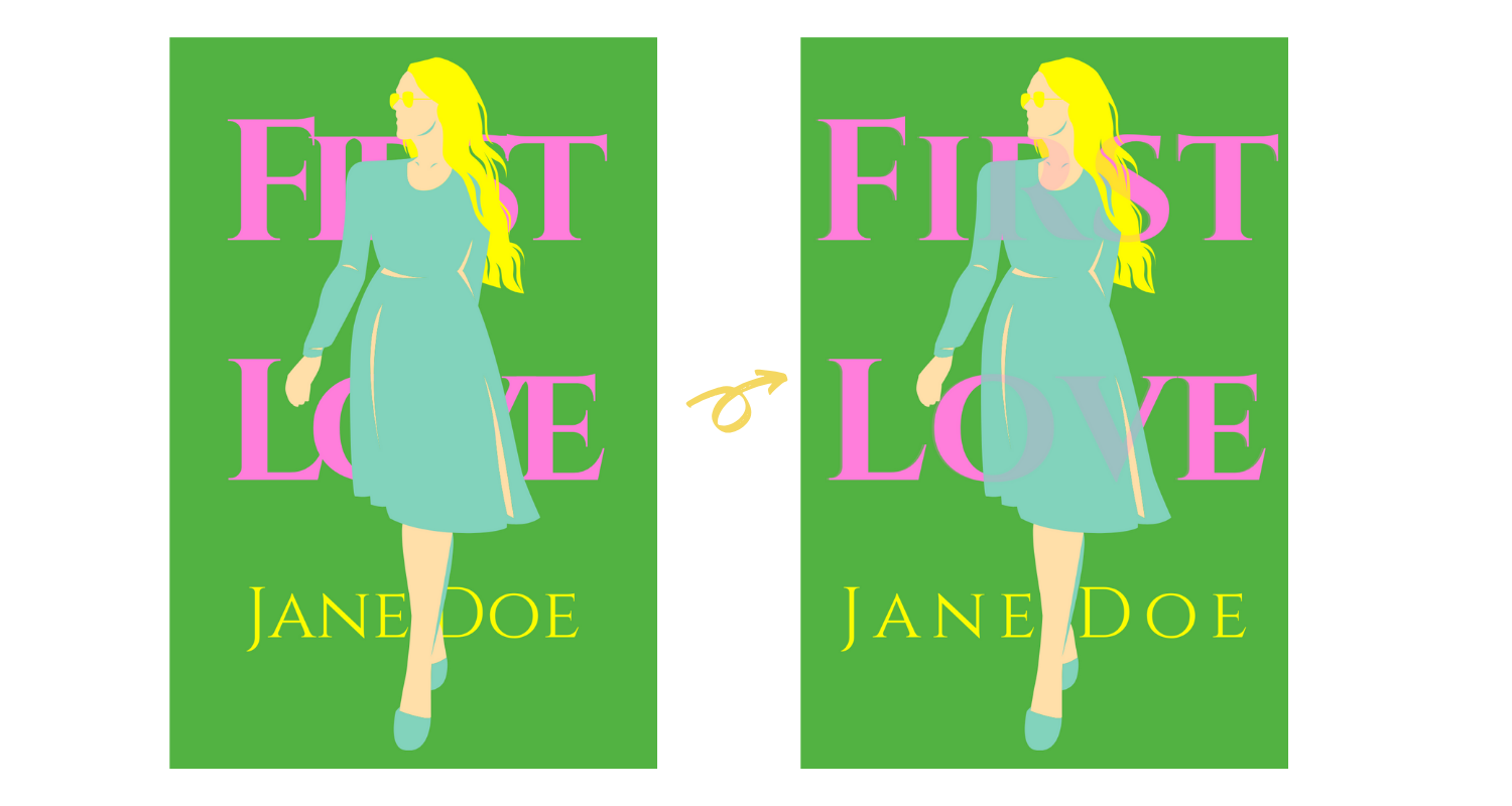
[A semi-transparent copy of the original title was added over the right image’s title and graphic to make everything more legible. The letters were also spaced out for better readability.]
IV: A hint of blue, or gold, or red!
If you prefer going for a more minimalist, black-and-white look, consider adding a hint of color to your cover as a finishing touch.

[A colorful graphic was added behind a monochromatic character, to draw attention to the cover.]
V: Oversaturated shades
Although there are always exceptions to this rule depending on your design, oversaturated colors should usually be avoided, as they have a tendency to make covers difficult to look at, which may cause potential readers to scroll past your novel instead of clicking on your series. A mix of bright and muted colors usually work best, or black-and-white, if you want to go for a more classic look.

[The oversaturated colors found throughout the left cover were changed to more muted, natural tones to make the cover easier to stare at for longer periods of time.]
VI: Rule of Three
Ideally, working with only two to three main colors (sometimes four), will help inspire a subtle sense of harmony in your design.

[A background was added to the original, left cover. Because this affected title and author name readability, two graphics were then added behind the cover’s text assets for easier legibility, which resulted in the final cover on right.]
That’s it! Congratulations on making it to the end of this tutorial, we wish you all the best with making your cover! Thank you very much for reading, have a wonderful day!
About the author:
Author of over 20+ web-serials, and winner of Tapas Media's second Writer's Camp, Beau Van Dalen’s novels Warrior of Hearts and Android Affection were published in 2020 by Tapas Media. To find out more about his works, click on the covers below, or check out Beau’s official website.


Looking for our tutorials?
Tips and Tricks for New Creators
Want to learn more about Tapas and our creators?
[Tapas Insider] Success through grit and dedication - Sera Swati
[Tapas Insider] Quarantine at Tapas
[Tapas Insider] Between Horror and Cute - Koolaid-Girl