

#005
Nov 21, 2020
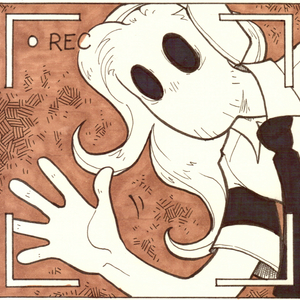
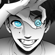
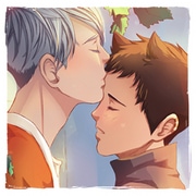
I wanted to write dialogues myself, but after the pages I’ve done I came to the conclusion that using a clear font is a little better than my own handwriting. I write pretty clearly, but a font is certainly more clear.
If you’re curious of which ones I’m using, it’s “I Hate Comic Sans” (yes it has a WONDERFUL name) for the dialogues, and “Mandrake FF” for Henry’s thoughts/handwriting.
Also I think I’m finally getting a bit the hand with grayscale? Maybe! I find this page a little clearer than previous ones. ^^
(Also not rushing the page, it... it kind of helps... KEK)
See ya next Saturday!
Recommendation for you
-
Recommendation
Autophobia
Romance 1m likes
-
Recommendation
Copper eyes
BL 1.1m likes
-
Recommendation
Humor me
Slice of life 3.2m likes
-
Recommendation
HAFU
BL 744.1k likes
-
Recommendation
Strange and Wild
Fantasy 828.2k likes
-
Recommendation
Bound-The Contract
BL 1.4m likes
-
Feeling lucky
Random series you may like
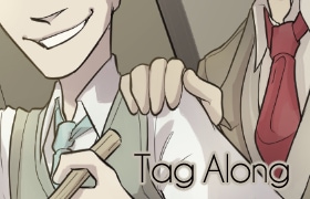
Tag Along
6.2k views110 subscribers
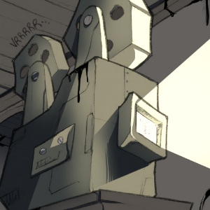
A Bendy and the Ink Machine reimagination and fan comic. A different route in a different version of the events.
Created, written and drawn by Silvia "Castiel" Scianatico (CinderSalad).
Based on the characters of "Bendy and the Ink Machine".
Not an official Bendy and the Ink Machine product. Not approved by or associated with Joey Drew Studios Inc.
Created, written and drawn by Silvia "Castiel" Scianatico (CinderSalad).
Based on the characters of "Bendy and the Ink Machine".
Not an official Bendy and the Ink Machine product. Not approved by or associated with Joey Drew Studios Inc.
Comments (5)
See all