


Chapter 2 - Part 2
Dec 01, 2023
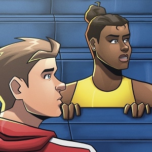
I’m trying out new panel grids because I felt like I was wasting too much space. And I wanted to play a bit more with the layout.
I’d love to hear what you think so far!
Top comment
Had to look back to notice the layout change and I personally like it when panels bleed into one another (I do this too, excessively, over a splash page cuz i hate white gutter space, so im a little biased, lol). It's very cleanly done and doesnt detract from the flow or artstyle, if that makes any sense.
Bottom line: I LIKE IT <3 Well done!
edit: reading on mobile, btw
Recommendation for you
Recommendation
Do You Even Witch
BL 4.7m likes
Recommendation
Hayden's notes
Mystery 181k likes

Recommendation
Strange and Wild
Fantasy 808.4k likes
Recommendation
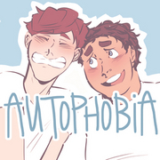
Autophobia
Romance 992.2k likes

Recommendation
A Love Unafraid
BL 771.5k likes
Recommendation
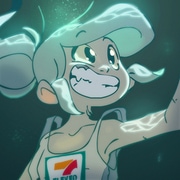
The Little Trashmaid
Comedy 795.4k likes

Feeling lucky
Random series you may like
Comments (2)
See all